CSS水平居中的7种实现方式
大约 3 分钟
CSS水平居中的7种实现方式
1. 实现方式
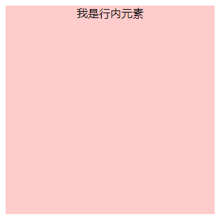
1.1 方式一:text-align: center实现
如果父元素是块级元素且里面包含行内元素,则直接给父元素设置 text-align: center, 如果父元素是行内元素的话父元素无法设置宽高,则需要将其设为块级元素display: block。也对inline、inline-block、inline-table和inline-flex元素水平居中都有效。
HTML
// 父元素是块级元素
<div id="parent">
    <span id="child">我是行内元素</span>
</div>

// 父元素是行内元素
<span id="parent">
    <span id="child">我是行内元素</span>
</span>
CSS
// 父元素是块级元素
.parent {
  height: 300px;
  width: 300px;
  text-align: center;
  background: skyblue;
}

// 父元素是行内元素
.parent {
  height: 300px;
  width: 300px;
  display: block;
  text-align: center;
  background: skyblue;
}
效果:
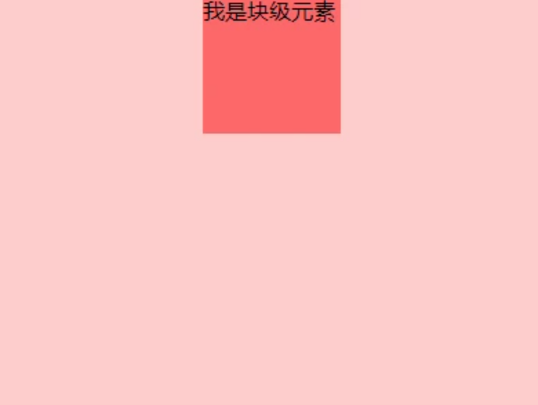
1.2 方式二:margin: 0 aoto实现
在宽度已知的情况下可以使用margin:0 auto,让元素水平居中。
HTML
<div id="parent">
    <div id="child">我是行内元素</div>
</div>
CSS
.parent {
  height: 300px;
  width: 400px;
  background:  #fcc;
}
.child {
  height: 100px;
  width: 100px; //确保该块级元素定宽
  background: #f66;
  margin: 0 auto;
}
效果:
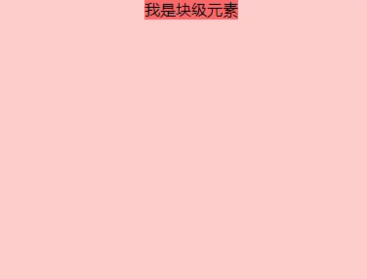
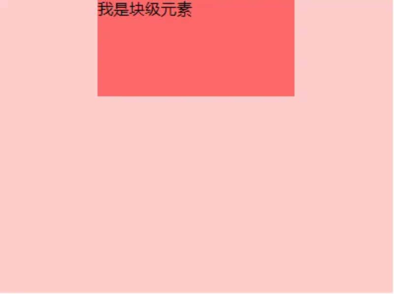
1.3 方式三:table+margin实现
先将子元素设置为块级表格来显示(类似),再将其设置水平居中display:table在表现上类似block元素,但是宽度为内容宽。
HTML
<div class="parent">
  <div class="child">我是块级元素</div>
</div>
CSS
.parent {
  height: 300px;
  width: 400px;
  background:  #fcc;
}
.child {
  display: table;
  background: #f66;
  margin: 0 auto;
}
效果:
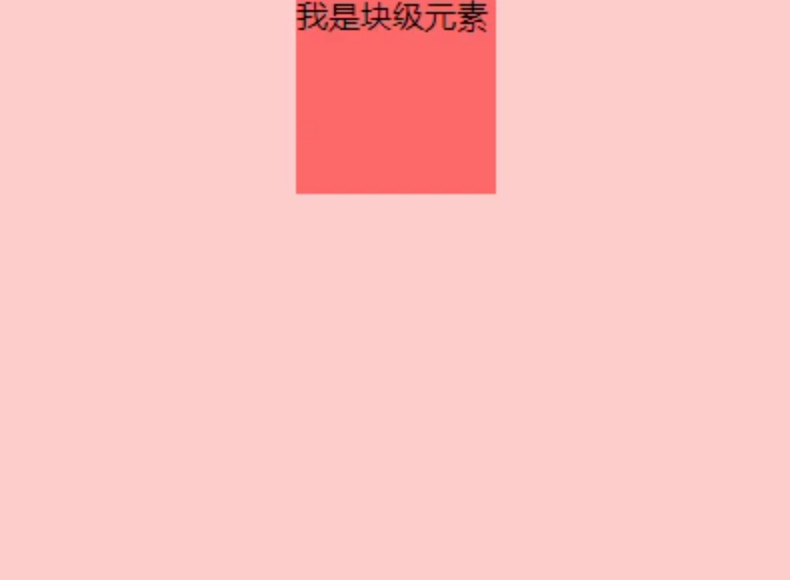
1.4 方式四:absolute+transform实现
首先设置父元素为相对定位,再设置子元素为绝对定位,首先设置子元素的left:50%,然后通过向左移动子元素的一半宽度以达到水平居中。
- 定宽度,设置绝对子元素的
margin-left:-元素宽度的一半px或者设置transform: translateX(-50%) - 不定宽,只能使用
transform: translateX(-50%)
HTML
<div class="parent">
    <div class="child">我是块级元素</div>
</div>
CSS
.parent {
  height: 300px;
  width: 400px;
  position: relative;
  background:  #fcc;
}
.child {
  position: absolute;
  background: #f66;
  left: 50%;
  transform: translateX(-50%); // 通用
  /** 定宽度可使用margin-left **/
  width:100px;
  margin-left:-50px;
}
效果:
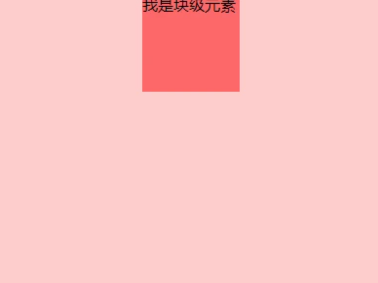
1.5 方式五:absolute+margin实现
通过子元素绝对定位,外加margin: 0 auto来实现。
HTML
<div class="parent">
    <div class="child">我是块级元素</div>
</div>
CSS
.parent {
  height: 300px;
  width: 400px;
  position: relative;
  background:  #fcc;
}
.child {
  position: absolute;
  background: #f66;
  width: 200px;
  height: 100px;
  margin: 0 auto; /*水平居中*/
  left: 0; /*此处不能省略,且为0*/
  right: 0;/*此处不能省略,且为0*/
}
效果:
1.6 方式六:flexbox实现
使用flexbox布局,只需要给待处理的块状元素的父元素添加属性 display: flex、 justify-content: center
HTML
<div class="parent">
    <div class="child">我是块级元素</div>
</div>
CSS
.parent {
  height: 300px;
  width: 400px;
  display: flex;
  justify-content: center;
  background:  #fcc;
}
.child {
  height: 100px;
  width: 100px;
  background: #f66;
}
效果:
1.7 方式七:flex+margin实现
通过flex将父容器设置为为flex布局,再设置子元素居中。
HTML
<div class="parent">
    <div class="child">我是块级元素</div>
</div>
CSS
.parent {
  height: 300px;
  width: 400px;
  display: flex;
  background: #fcc;
}
.child {
  height: 100px;
  width: 100px;
  margin: 0 auto;
  background: #f66;
}
参考文章
Loading...