flex布局示例(骰子的布局)
大约 3 分钟
flex布局示例(骰子的布局)
简介
骰子的一面,最多可以放置9个点。
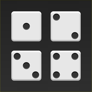
下面,就来看看Flex如何实现,从1个点到9个点的布局
如果不加说明,本节的HTML模板一律如下。
<div class="box">
  <span class="item"></span>
</div>
上面代码中,div元素(代表骰子的一个面)是Flex容器,span元素(代表一个点)是Flex项目。如果有多个项目,就要添加多个span元素,以此类推。
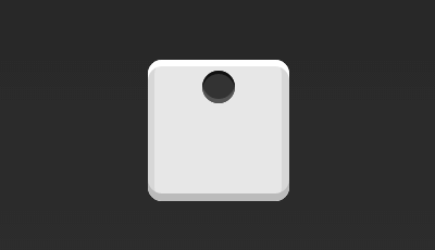
单项目
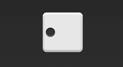
首先,只有左上角1个点的情况。Flex布局默认就是首行左对齐,所以一行代码就够了。
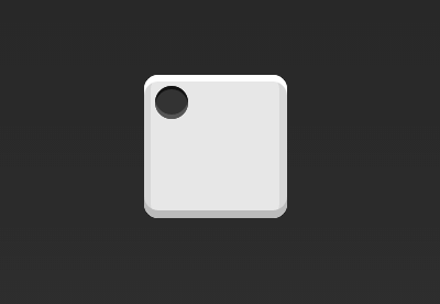
.box {
  display: flex;
}
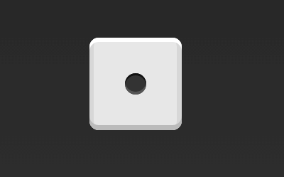
设置项目的对齐方式,就能实现居中对齐和右对齐。
.box {
  display: flex;
  justify-content: center;
}
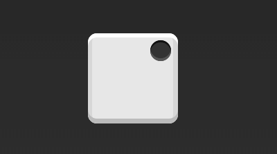
.box {
  display: flex;
  justify-content: flex-end;
}
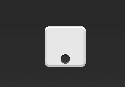
设置交叉轴对齐方式,可以垂直移动主轴。
.box {
  display: flex;
  align-items: center;
}
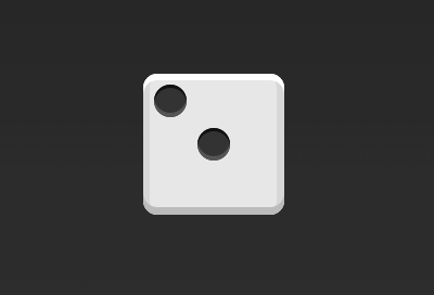
.box {
  display: flex;
  justify-content: center;
  align-items: center;
}
.box {
  display: flex;
  justify-content: center;
  align-items: flex-end;
}
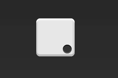
.box {
  display: flex;
  justify-content: flex-end;
  align-items: flex-end;
}
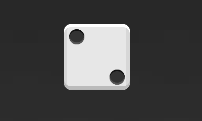
双项目
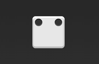
.box {
  display: flex;
  justify-content: space-between;
}
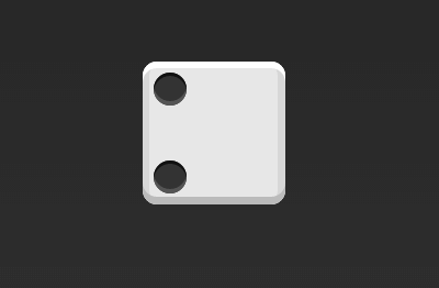
.box {
  display: flex;
  flex-direction: column;
  justify-content: space-between;
}
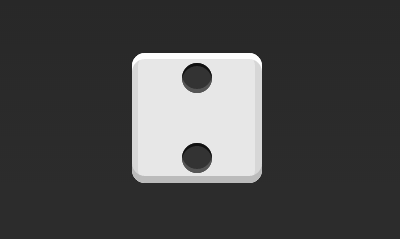
.box {
  display: flex;
  flex-direction: column;
  justify-content: space-between;
  align-items: center;
}
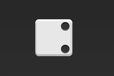
.box {
  display: flex;
  flex-direction: column;
  justify-content: space-between;
  align-items: flex-end;
}
.box {
  display: flex;
}

.item:nth-child(2) {
  align-self: center;
}
.box {
  display: flex;
  justify-content: space-between;
}

.item:nth-child(2) {
  align-self: flex-end;
}
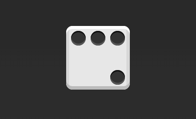
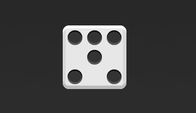
三项目

.box {
  display: flex;
}

.item:nth-child(2) {
  align-self: center;
}

.item:nth-child(3) {
  align-self: flex-end;
}
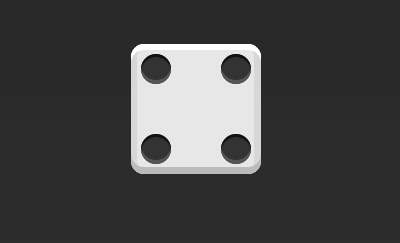
四项目
.box {
  display: flex;
  flex-wrap: wrap;
  justify-content: flex-end;
  align-content: space-between;
}
HTML代码如下。
<div class="box">
  <div class="column">
    <span class="item"></span>
    <span class="item"></span>
  </div>
  <div class="column">
    <span class="item"></span>
    <span class="item"></span>
  </div>
</div>
CSS代码如下。
.box {
  display: flex;
  flex-wrap: wrap;
  align-content: space-between;
}

.column {
  flex-basis: 100%;
  display: flex;
  justify-content: space-between;
}
六项目

.box {
  display: flex;
  flex-wrap: wrap;
  align-content: space-between;
}
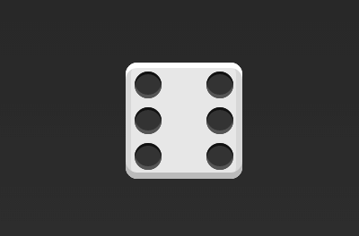
.box {
  display: flex;
  flex-direction: column;
  flex-wrap: wrap;
  align-content: space-between;
}
HTML代码如下。
<div class="box">
  <div class="row">
    <span class="item"></span>
    <span class="item"></span>
    <span class="item"></span>
  </div>
  <div class="row">
    <span class="item"></span>
  </div>
  <div class="row">
     <span class="item"></span>
     <span class="item"></span>
  </div>
</div>
CSS代码如下。
.box {
  display: flex;
  flex-wrap: wrap;
}

.row{
  flex-basis: 100%;
  display:flex;
}

.row:nth-child(2){
  justify-content: center;
}

.row:nth-child(3){
  justify-content: space-between;
}
九项目

.box {
  display: flex;
  flex-wrap: wrap;
}
参考文章
Loading...